


A bold design can grab attention, but an effective one can hold it. All-over t-shirt printing gives you that chance – but only if your composition makes sense on a three-dimensional surface. We’re talking flow, continuity, and balance to ensure the artwork feels designed for the body, not just pasted on it.
Here are a few tips to keep in mind when designing all-over t-shirt prints:
- Balance bold colors. Mixing bold hues with neutrals prevents your design from visually overwhelming the viewer. Using high-saturation colors across the entire garment can tire the eyes quickly. For example, pair a striking neon logo with a muted, grayscale background pattern to give the design necessary depth and rest areas.
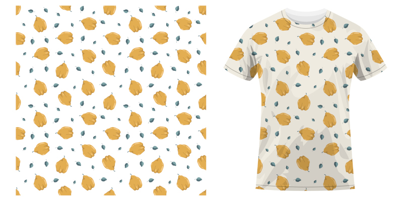
- Include seamless repeats. Give your design a truly continuous flow by perfecting the pattern tile. A repetitive motif that obviously starts and stops across the fabric looks amateurish. Instead, create large, seamless tiles where the edge of the pattern matches perfectly, fooling the eye into seeing an uninterrupted textile.
- Experiment with abstract patterns. Abstract designs effectively utilize the shirt’s full real estate because they do not rely on precise alignment across seams. Geometric shapes, liquid textures, or gradient fields avoid the distortion issues that plague large photographic images wrapped around the body. This ensures you maximize the effectiveness of your custom t-shirt printing investment.
Whether you are designing for a brand, event, or merchandise line, the key to exceptional all-over t-shirt printing is intentional design. Every color, shape, and placement should work together to support your message. Contact our t-shirt printing team at Common Threads Embroidery and Apparel to bring your design to life.